9 Assessment of Physical Environment
In Section 8, we looked at how we can use some secondary data to surface important insights about how these roads are used. Let us now look at how we can use other parts of the physical environment to measure walkability through easily available data. Table ?? shows some indicators and how they can help you understand how walkable an area is. There are many more that other studies have collated (Knapskog et al. 2019), but I will be going over these because the data to analyze these is easily accessibly through OpenStreetMaps and hence should work for most cities.
These measures have been divided into two; those that tell you about the walkability of a bounded region and those that help describe how much a place allows movement to other places within it. As Table ?? shows, there is more than one indicator that you can use to answer these questions and for the most comprehensive understanding, it is better to use these together.
9.1 Measuring permeability
Permeability refers to how easy or difficult it is for people to move through a specific location. It is mainly concerned with the physical features of the space, such as the design of the streets, buildings, sidewalks, and public spaces. A high permeability space is easy to navigate, with multiple entrances and exits, clear paths, and few barriers. On the other hand, a low permeability space is harder to navigate, with limited access points, narrow pathways, and obstacles that make it challenging for people to move through.
A method for calculating permeability was developed by Pafka and Dovey (2017) through two measures - Area-weighted average Perimeter () and Interface Catchment (). By using their associated QGIS plugins, performing this analysis is a trivial task (the section below is distilled from their video on the topic).
We’ll focus on in this chapter.
You’ll need the following before you get started:
1. The plugin for QGIS, which can be downloaded from the plugins manager (search for ‘AwaP’) or through the online repository.
2. A city block map for your area of interest. Appendix 18 describes how to do this with a road network layer from OpenStreetMaps.
9.1.1 Calculating in QGIS
This section assumes you have your city block map ready. You will not need anything else. For this example, I’ll select Bangalore’s central business district area (covering MG Road, Majestic and others).
Figure 9.1: Load in a simple base map of city blocks for your interest area.
Step 1. Create a Grid
Go to Plugins > AwaP to bring up the dialogue box to get started. Since we have a large area, we’ll visualise this as a choropleth map. Begin by selecting Multiple Polygons in the Boundary layer options and clicking the button that says Create a polygon grid to bring up the grid dialogue box:
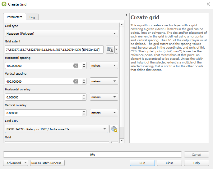
Creating a grid
I like to choose hexagons are my grid shape. Why? There are some advantages of using hexagons to map things because they tessellate better and more organically than a rectangle, but it is also a stylistic choice; I like how the look.
For Grid Extent, set your extent as you wish (If you’re coming from just creating your city block map from Section 18, you can use your base layer to keep things simple).
I set the Horizontal Spacing to , which is what the hexagon would measure from one edge to the other one across. This is up to your needs, but is something I prefer as studies consider this a distance that is comfortably walked (Duncan et al. 2013).
Step 2. Configure settings
Once your grid has been made, return to the dialogue box, which should still be open. Here, you can:
- Choose the amount of area of the grid a block should occupy to be considered as a part of that grid. The default value is okay for most cases.
- Choose to remove dead-ends (cul-de-sacs) from the analysis, as they imply that there’s no way to ‘permeate’ past that point anyway (this might be discriminatory to ghosts).
But the most important setting here is the Apply custom style categories dropdown. You must set it to by AwaP so that only a single layer with all the values is output.
Click run.
You should get something like Figure 9.2.
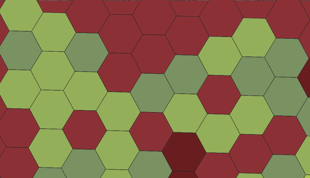
Figure 9.2: Hexagon grid with colors mapped to values.
If you see coloured hexagons, your analysis has been successful. But we can’t understand anything by just looking at this, so head over to the Layer Properties and in the Layer Rendering section of the Symbology tab, change the blend mode to something that allows the city block map also to show through. Changing mine to Overlay gives me the map shown in Figure 9.3.
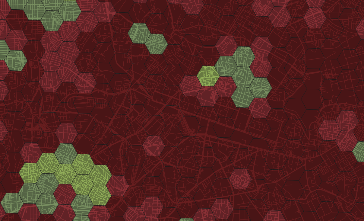
Figure 9.3: Block sizes in CBD, Bangalore.
If you zoom out, you can see how different areas compare.
9.1.2 Understanding the map
By adding context of the underlying layout, the map becomes easier to read and more useful.
The colors on the map are correlated with the size of the blocks that they are over. Red areas on the map tend to have larger blocks, which can make it challenging to navigate around the area or find shortcuts. Large blocks can limit the number of streets or intersections available, which can result in longer travel times and limited options for getting from one place to another. In contrast, green areas on the map feature smaller blocks, which tend to have more intersections and roads. Even if these areas do not have sidewalks, there are typically multiple ways to get from one place to another, making it easier to navigate and explore.
If you need even more resolution for your specific area, you can adjust the size of the grid blocks on the map. This will provide a more detailed view of the area. Can you make one for your site now?
9.2 Measuring connectivity
In Section 8.1.3, we explored two components of space syntax analysis (SSA); choice and integration. SSA also allows you to measure the connectivity of regions within the network.
You can follow the steps in Section 8.1.4 to process your street network and find the Connectivity layer in DepthmapX. Using the CBD region as an example, we get shades of yellow, blue and orange, as shown in figure 9.4.
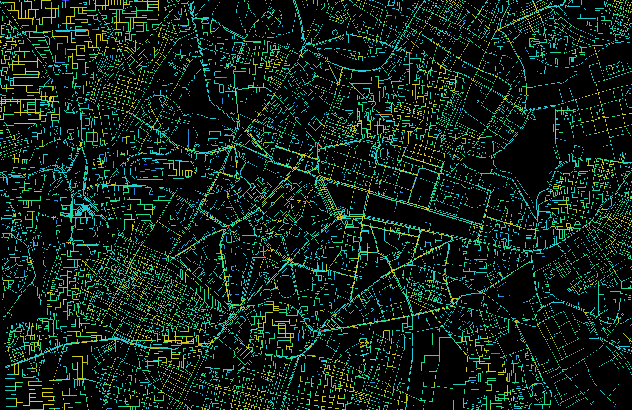
Figure 9.4: There’s a lot going on this map, can we simplify it?
What do these colours mean? We can understand the warmer regions as being more connected to each other, making it very easy to travel within those spaces (Dettlaff, n.d.). This results from the number of connections, or intersections, each street has to its directly neighbouring streets. Long roads, such as highways, do not provide ways for people to get off them if necessary.
We can make this even easier to see if I tweak the colours. Do this by going to View > Color Range and opening the colours dialogue box. It gives you multiple default gradients to choose from, and by tweaking the sliders a little, you can increase or decrease how prominently each colour appears.
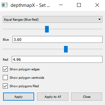
Tweak the color ranges to your liking
I prefer to have my reds stick out a lot more as it helps me find spatial ‘islands’ separate from each other but well-connected within themselves, as shown in Figure ??. Immediately, we can see that clusters are emerging from the map. These high intersection density regions are more inviting to walk in, and chances are, this is where you’d find the most pedestrians. Can you make your map to visualize this metric?
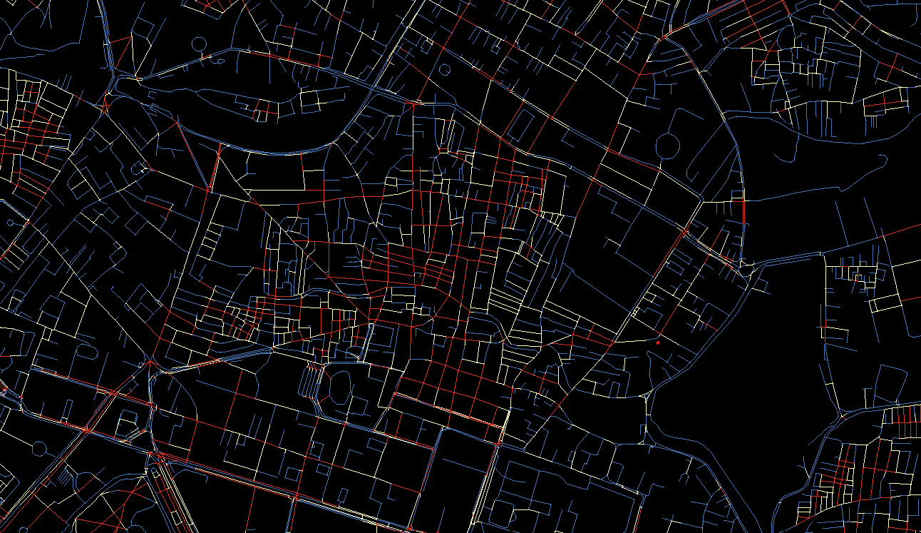
Figure 9.5: Visualizing connectivity