10 Assessment of Infrastructure Accessibility
Walking is the ideal last-mile solution for transportation, but it’s only feasible if the infrastructure is accessible. In this section, we will assess the infrastructure accessibility in our study site.
10.1 Sourcing data using OpenStreetMaps
OpenStreetMap is the best readily available data source for most of your analysis needs because, unlike commercial maps like Google Maps and Bing Maps, all data on OSM can be downloaded and taken into your favourite GIS tool. You can even add details about your neighbourhood to document your surroundings better, such as adding information on sidewalks, CCTV cameras or streetlights (safeyelli2022?).
In OSM, the map is divided into three main components: nodes, edges, and relationships. Nodes are points on the map, such as buildings or points of interest, while edges are lines that connect them, like roads, rivers, and rail networks. Relationships describe how nodes and edges relate to each other, such as how Bangalore is a city within Karnataka.
One of the biggest strengths of OSM is its thorough documentation. Users can explore and select features on the map using the select query button, which brings up a list of features in the area. Each item in the list is tagged and annotated, providing detailed information about its type, category, name, and even who added and verified the information.
Geofabrik is one of the most accessible sources of downloadable OSM data, providing pre-processed extracts of OSM data for various regions and countries around the world. The data provided by Geofabrik includes all OSM features, including roadways, water features, and buildings, among others.
In addition to Geofabrik, you can create custom queries to download specific OSM data based on their needs. This can be done using tools like Overpass Turbo, which allows you to build and run queries to extract particular features from OSM data.
10.1.1 Using Overpass Turbo
As you delve deeper into the world of OSM, you’ll inevitably want to extract data from it. While you can use a large dataset like Geofabrik offers, you might want to get what you need and nothing more. That’s where Overpass Turbo comes in handy. Overpass Turbo is a user-friendly interface for running queries against the OSM database using the Overpass API.
First, identify what you’re looking for on OSM’s interface to start with Overpass Turbo. Are you trying to locate toilets, metro stations, shops, or something else? Once you’ve identified the features you’re interested in, examine their tags to understand how OSM categorizes them.
For example, let’s say you want to find all the toilets in Bangalore. A quick search on Google tells you that OSM categorizes toilets under amenity. To build a query in Overpass Turbo, open up the Turbo query wizard and type in your query:
amenity=toilets in Bangalore Hit the run button, and you’ll get a map of all the toilets in Bangalore! Or, you could find all the completed and proposed metro stations in the city as well (figure 10.1).
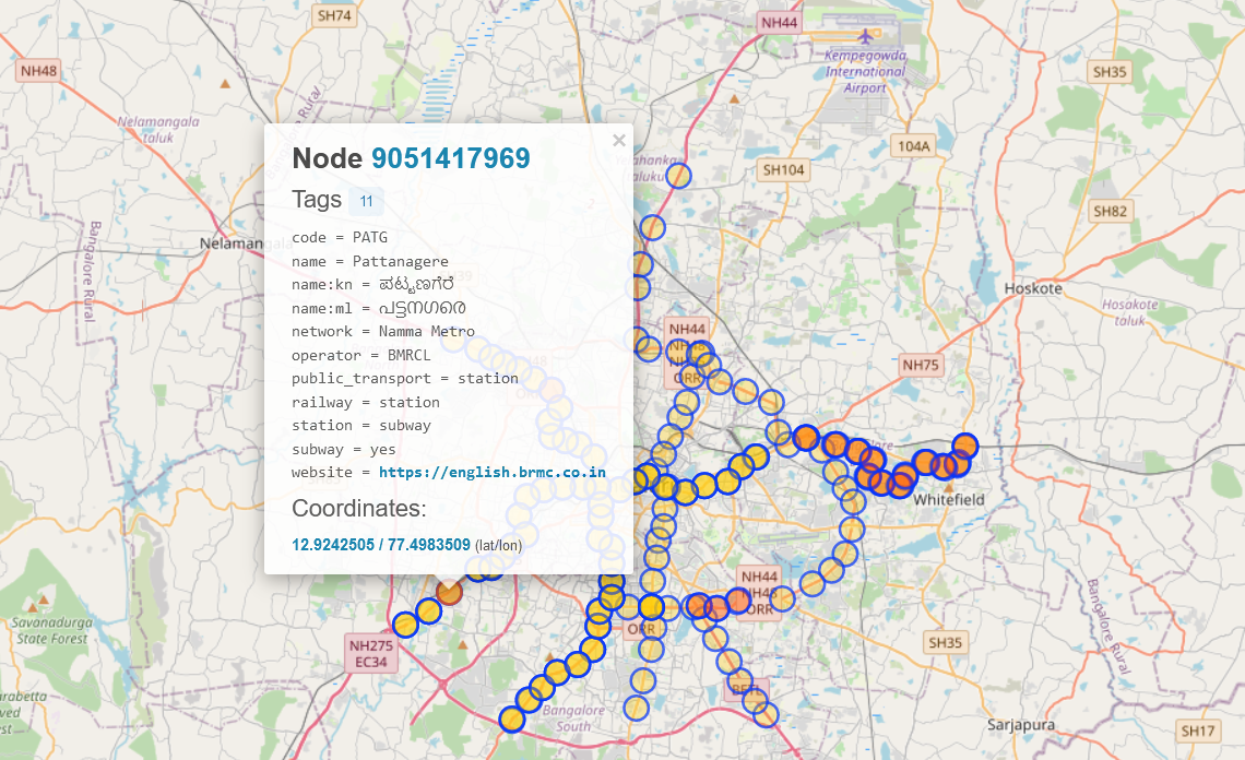
Figure 10.1: Locations of metro stations in Bangalore on OSM. Each one has detailed tags that help you search for them.
But why stop there? Overpass Turbo lets you play with all sorts of queries to extract the needed data. Here are a few examples to get you started:
operator:BMRCL and subway=yes in Bangalore    // Metro lines and stations
amenity=restaurant in Bangalore              // Restaurants
highway=footway and bridge=yes in Bangalore  // Footbridges
natural=water in Bangalore                   // Lakes
Table 10.1 shows some more sample queries to get you started.
Once you’ve settled on the query you want to use, you can export the data as a GeoJSON file by clicking on the “Export” button in the top bar of Overpass Turbo. From there, you can visualize the data in your favourite GIS software or share it with others for further analysis.
10.2 Visualizing ped sheds
Calculating the walking areas, also known as ped sheds, around a specific point is a critical step in determining the walkability of a particular location. By defining the areas within exact walking distance, we can better understand the accessibility of the site for pedestrians. To perform this task, we will use the “OpenRouteService” tool.
Before starting, you must set up ORS tools to work with QGIS. The process for this is described in Appendix 19.
Open the tool by clicking the ‘ORS’ button on the toolbar; it should be shaped like the hexagonal ORS logo. Otherwise, you can go to Web > ORS Tools.
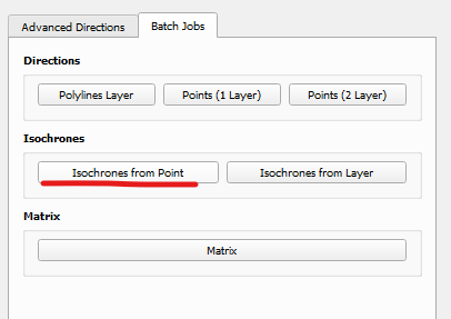
Figure 10.2: We can also choose to visualize an entire point layer
Select Isochrones from Point 10.2
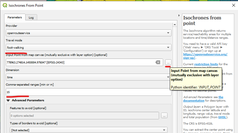
Figure 10.3: Setting up the isochrone
In the dialog box that appears (fig. 10.3), select the “foot-walking” option as the travel mode. You can do this in various other methods, such as hiking, cycling, or driving.
Click on the “…” button in the Input field to locate the point on the canvas. You can select the point by clicking on the map or entering the coordinates manually.
In the Dimension field, select Time since this is the value we’re interested in. After this, enter the time range you’d like to calculate in the ranges field. For example, if you want to find reachable areas within a 15-minute walk, set the time range to 15 minutes. You can also select multiple time ranges, such as 5 and 15 minutes, to see the different walking areas around the point. These will need to be separated by commas. I will visualize a ped shed for the Cubbon Park metro station for 10 and 15 minute values.
Click on “Run” to generate the map showing the reachable areas within the specified walking time.
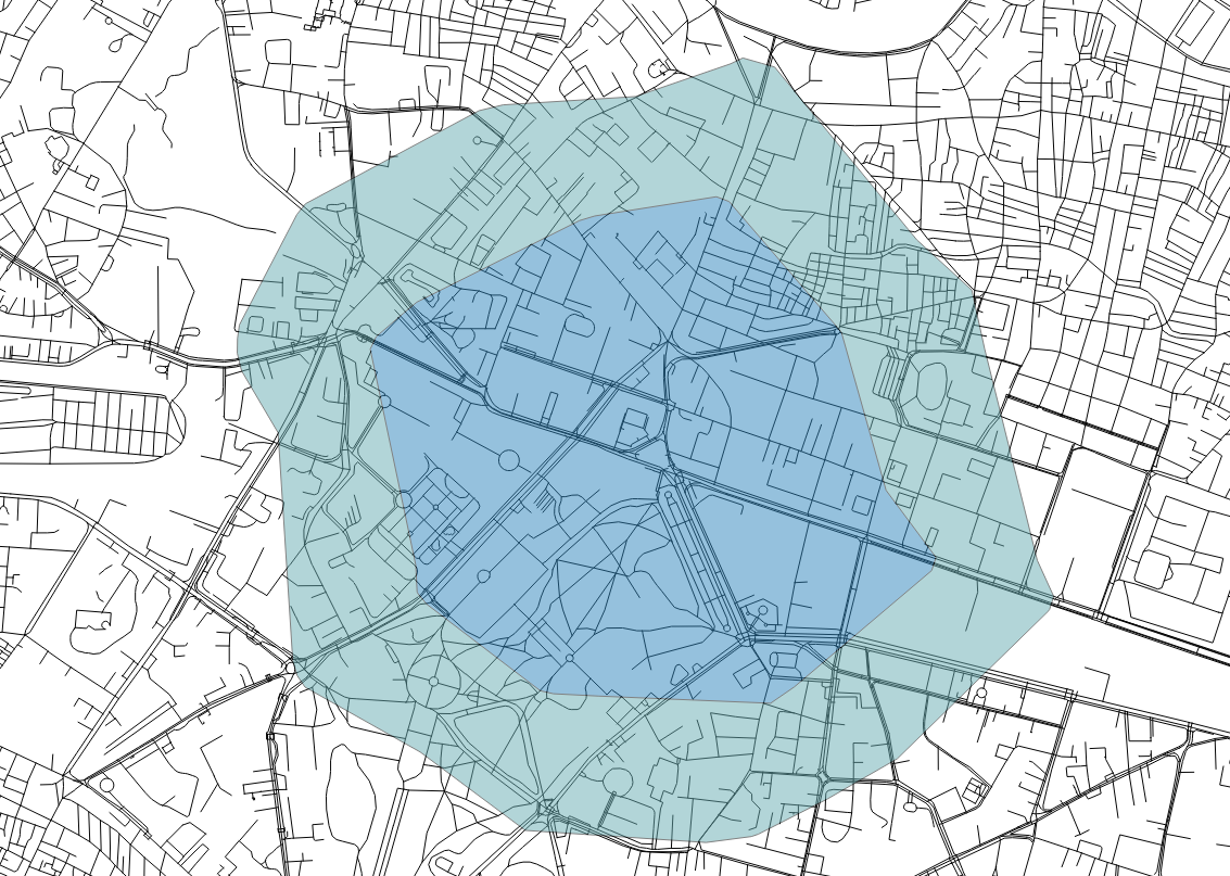
Figure 10.4: Starting from the Cubbon Park metro station, this isochrone visualizes 10 and 15 minutes walking times.
The resulting map (figure 10.4) will show the different areas within walking distance of the specified point. This information is critical for understanding the walkability of a particular location and identifying areas that may need improvement to enhance pedestrian accessibility. You can use these to calculate walking areas around bus stops, commercial spaces, hospitals, public toilets, etc.
10.2.1 Understanding isochrones
Knowing the walking areas around a point is critical for understanding the accessibility of the site for pedestrians. By knowing which areas are within a specific walking distance, we can identify potential areas of improvement, such as missing sidewalks, pedestrian crossings, or other infrastructure that can improve the pedestrian experience. We can also identify areas where people are less likely to walk because they are too far away from their destinations, which can inform future planning and development.
In addition to identifying areas for improvement, the information generated from calculating the walking regions can also be used to evaluate the effectiveness of past improvements or interventions. For example, suppose a new pedestrian bridge or crossing has been constructed. In that case, the walking areas can be recalculated to see if it has improved accessibility or if areas still need further attention.
You might also notice that the shapes that are output are irregular. The shape of the isochrone depends on the terrain and the road network. If the area has hills or other physical barriers, it may take longer to walk or drive to certain areas, resulting in irregularly shaped isochrones. Similarly, if the road network in the area is not well connected, it may take longer to travel between specific points, resulting in irregularly shaped isochrones.