11 Assessment of Comfort
So far, we’ve only analyzed things in terms of the physical environment or the consequence of that environment on mobility. This is where most street audits stop. This is the environment in so-called ‘lab conditions’ - it is imagined to be without any other unpredictable factors that affect its usage; we assume that if the correct number of sidewalks exist and the numbers look nice after an analysis, the area is walkable to users. This is a sterile and detached way of assessing walkability because it leaves out important factors that influence people’s walking behavior, such as their comfort levels and the impact of variables we did not account for, such as weather conditions (Tong, n.d.).
To fully understand walkability, it is crucial to assess walking comfort, which involves evaluating how people feel while walking in a given environment. This includes not only factors such as the quality of the pavement and the width of sidewalks but also considering the impact of weather on walking behavior. People may be less likely to walk in extreme weather conditions such as heavy rain, snow, or excessive heat. Assessing walkability in different weather conditions can help identify areas where improvements could be made to encourage more walking, such as adding shelters or improving drainage to reduce the impact of rain. Section 14.3 discusses this in more detail in the context of Ejipura and how to approach this qualitatively, but this section will focus on examining some key factors most likely to affect Indian cities.
11.1 Combining data
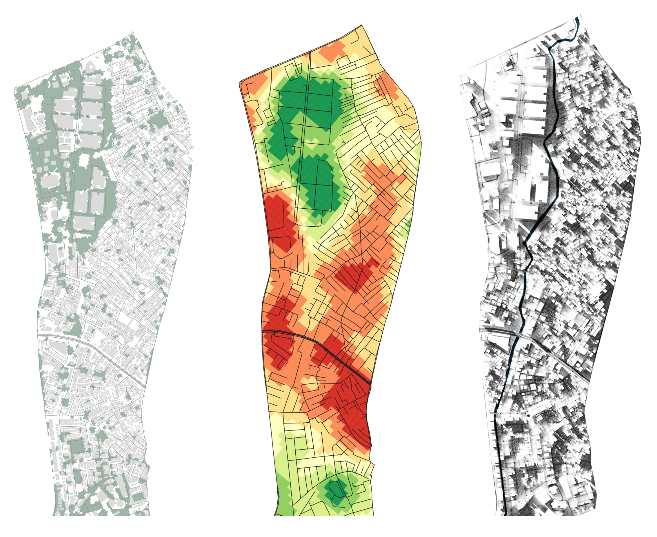
Figure 11.1: (Left to right) Green cover extent, LST variation and mapping shade due to buildings in Ejipura. Overlaying multiple visualizations like this illustrates how these factors are inter-related.
Green cover, heat island, and shade map analyses provide crucial insights for conducting a comprehensive walkability audit. These maps can help identify areas where walking is uncomfortable due to high temperatures and inadequate shade. Furthermore, they can identify areas where additional green spaces and shading devices are required to enhance the walking experience. Heat island maps enable us to mitigate temperature impacts on pedestrians by increasing green coverage in areas where temperatures are higher. The use of shading devices such as trees and canopies can also make walking more comfortable by providing relief from the sun. Combined with data on pedestrian traffic and infrastructure, we can use these maps to help develop effective strategies for enhancing walkability and promoting sustainable transportation.
11.2 Green cover
Mapping green cover is a critical step in understanding the walkability of urban areas. Urban green spaces such as trees, shrubs, and grass beautify the environment and provide numerous benefits, such as reducing the urban heat island effect, improving air quality, and providing shade to pedestrians. It has been found that the presence of green spaces can also promote physical activity and improve mental health.
In the context of Ejipura, a neighborhood in Bangalore, the lack of green cover has been identified as a significant issue affecting the area’s walkability. In Section 14.3, I explain how we found that most locals were dissatisfied with the lack of green space in their area. This lack of green space not only negatively impacts the area’s walkability but also adversely affects the overall health and well-being of the residents.
To visualize this issue, we can use satellite data from the Sentinel satellites to map the green cover in the area. Sentinel satellites are a series developed by the European Space Agency (ESA) that provide high-resolution images of the Earth’s surface. These images can be used to map vegetation cover and monitor changes over time. We will only visualize the green cover on a specific day.
11.2.1 Mapping green cover with Sentinel imagery
Head to the Sentinel Hub and create an account. The Hub allows us to easily access satellite imagery for all available dates from multiple sources, such as Landsat and the sentinel array of satellites.
Once you have your account, go to the EO Browser. This is where you will search for your location and browse images.
Search for your area of interest on Sentinel...
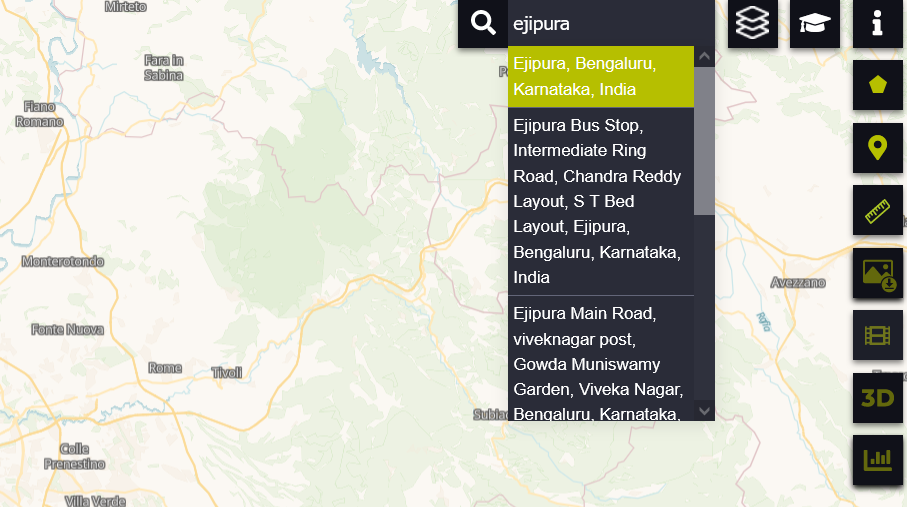
In the upper right-hand corner, locate the search bar and search for your region of interest (for now, Ejipura). The map should re-center.
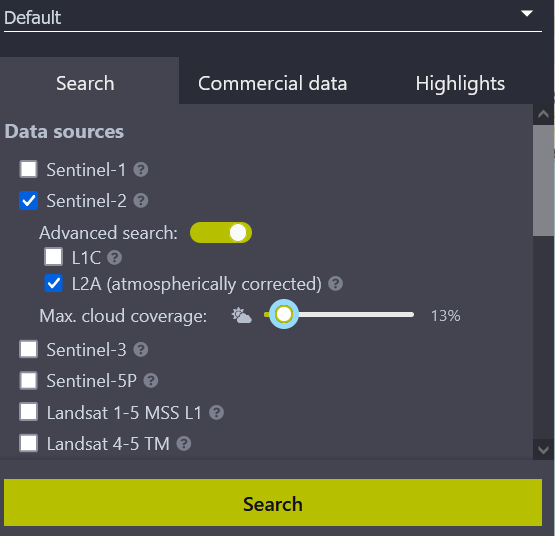
Figure 11.2: ...and then select your data source.
The left-hand panel (11.2) will allow you to select the satellite from which you’d like to source the data. We will choose Sentinel 2, toggle Advanced Controls, and set the Max. cloud coverage to a low value. This automatically filters out imagery obscured by cloud cover, so we have clear images to analyze.
By default, the search fetches the latest images, so if it brings no results, try adjusting the cloud coverage value to something more reasonable. Generally, anything between 15-30% is okay. Run the search.
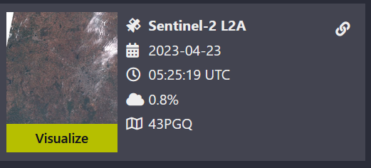
Figure 11.3: Search for images with least cloud cover so your data analysis can be better.
The results that load should look something like figure 11.3. The essential details are the date, time, and cloud cover percentage. Please select any one of them by clicking visualize.
In the map area, what should load first is the True Color image of Ejipura. The layers panel will also update with various pre-processed ‘bands’ that give you different levels of information about the same region. Relevant bands are explained in 11.1.
| Layer Name | Relevance |
|---|---|
| True Color | Provides a natural color representation of the area of interest |
| False Color (urban) | Helps identify vegetation and its density |
| NDVI | Enhances urban features such as roads and buildings |
| NDWI | Reveals water presence in the site, useful for mapping flooding extents |
Select the NDVI layer.
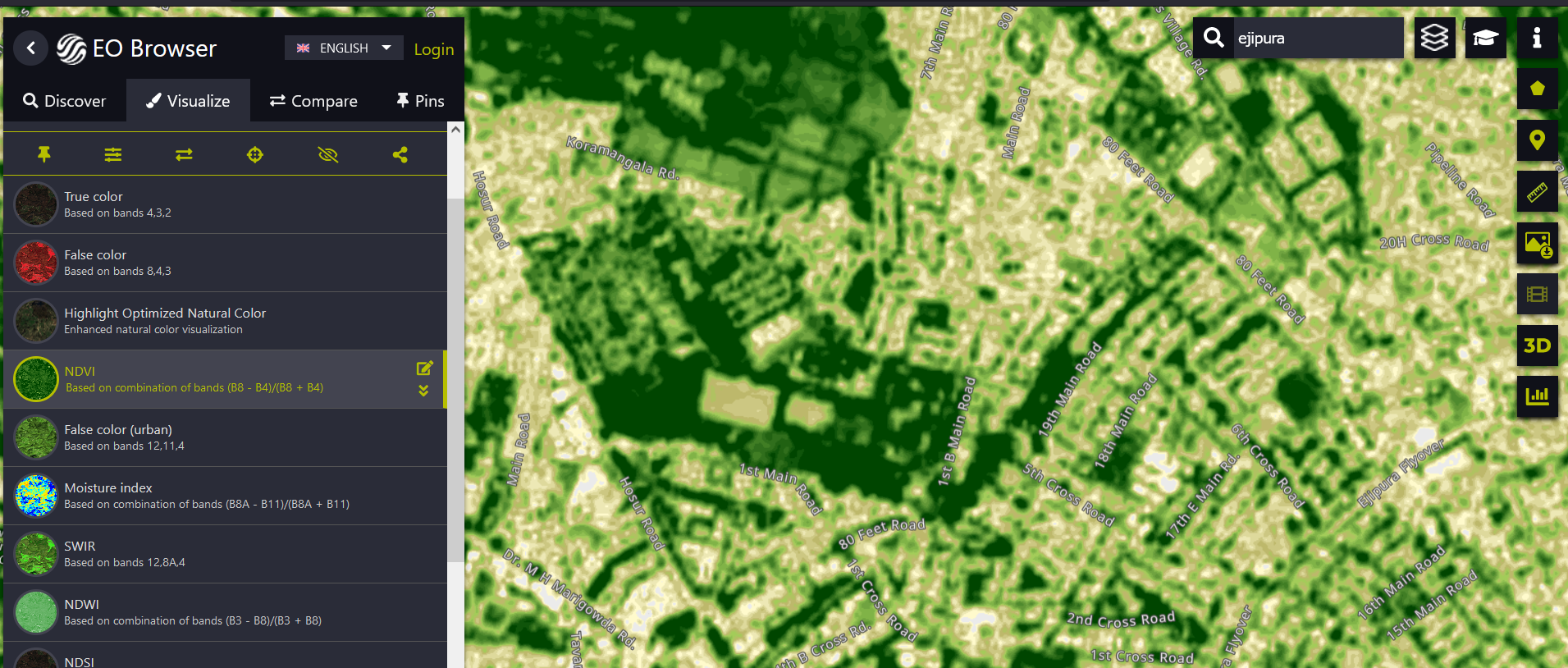
Figure 11.4: Selecting various layers allows us to see calculated bands right in the browser
The green cover is already visible in the raw image (11.4); you can quickly see how well we can use this data. While you could just download this and use it to make your case, we can turn this into a nicer visualization and use it for further analysis.
To download this, locate the download image button on the right. This should bring up the download dialog box. Switch the tab to Analytical and change your settings to those shown in figure 11.5.
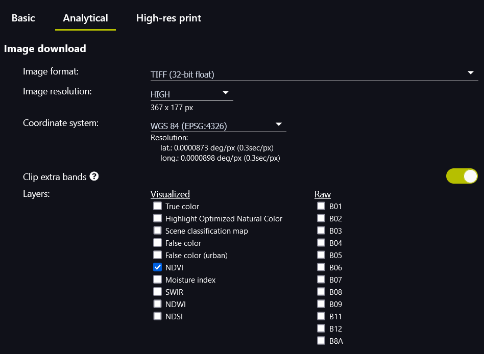
Figure 11.5: Recommended export settings.
- Image Format TIFF (32-bit float), high resolution
- Coordinate System: WSG 84 (EPSG:4326)
Download your file!
Open up QGIS and load your image. Please make sure your Project CRS is set to the relevant UTM zone. If you are performing this analysis for an Indian city, it is UTM 43N.
Download QGIS Model
To make the next stage of your analysis even more manageable, I have compiled a reusable workflow for the next steps. This will convert your raster file into a vector choropleth map that you can design perfectly. Download this model here.
You will also need an extent file to help crop the map to the area you’re interested in. You could download this from OSM (10.1.1) or draw this layer out yourself. Since this is an analysis of Ejipura, here’s an outline of the ward as well.
You should now have your image from Sentinel and an ‘extent’ layer in the form of an outline, a bounding box, or any other shape you might have drawn. You should also have downloaded the Extract Green Cover model from above.
To import the model, you can do one of two things:
Drag and drop the model into your project. This should bring up the dialog box in Figure 11.6.
-
Place the model in the correct system folder so you can access it from the Processing Toolbox later. The location of QGIS model files may vary based on your operating system. Here are the file paths for each:
- Windows:
C:\Users\[YOUR USERNAME]\AppData\Roaming\QGIS\QGIS3\profiles\default\processing\models - Mac:
/Users/[YOUR USERNAME]/Library/Application Support/QGIS/QGIS3/profiles/default/processing/models/ - Linux:
/home/[YOUR USERNAME]/.local/share/QGIS/QGIS3/profiles/default/processing/models/
Remember to replace
[YOUR USERNAME]with your username. - Windows:
Adhvaryu, Chopde, and Dashora (2019)
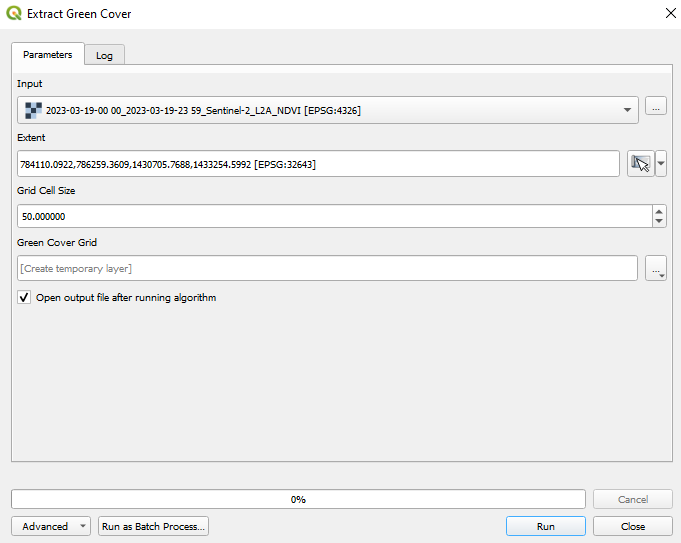
Figure 11.6:
For input, select the Sentinel raster image. Use the extent layer to calculate the extent (Dropdown > Calculate from Layer > Select Layer).
The Grid Cell Size value does not need to be changed but controls the size of the hexagonal grid cell (in meters). The default value works well. Run the action.
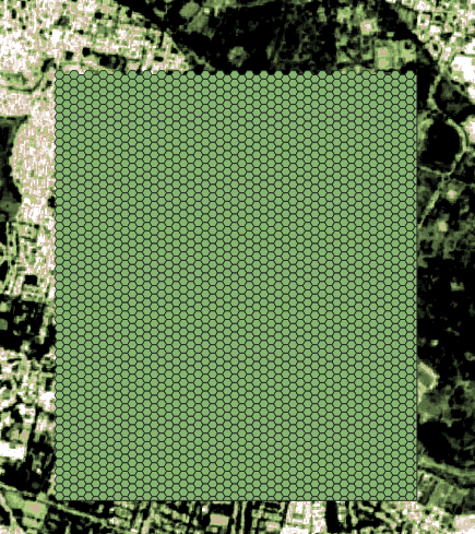
Figure 11.7: ‘Green Cover Grid’ layer once the model runs
You should now have a layer called Green Cover with just hexagons in it (11.7). Open up the Symbology tab in layer properties and select Graduated from the dropdown menu.
Set the input to NUM_POINTS, choose a nice color palette, and click classify. Et voila, you have figure 11.8.
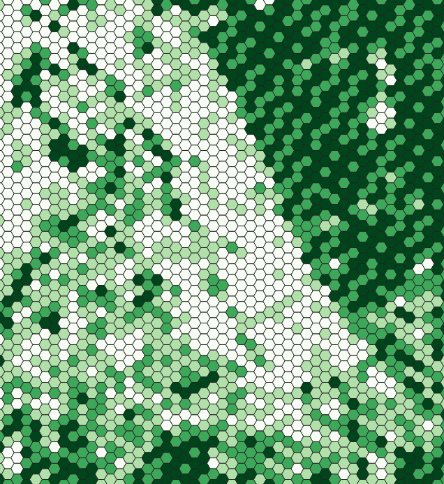
Figure 11.8: Applying graduated symbology reveals the underlying pattern.
The NDVI data from Sentinel has now been converted into something you can keep designing and improving. Here are some ideas on what to do further:
- Count the length of road segments possibly ‘passing’ under trees.
- Is the green cover clustered, or is it evenly distributed?
- Overlay the green cover map with the population density map to see if any areas have high population density but low green cover.
- Analyze the change in green cover over time to see any trends or patterns.
11.3 Heat islands
Land surface temperature (LST) is a crucial indicator of the thermal conditions of urban areas, providing valuable insights into the comfort of walking in different parts of the city. Unlike weather data that measures the air temperature at specific locations, LST is the temperature of the Earth’s surface as measured by satellite sensors, using Landsat imagery to calculate the surface temperature at a high resolution of 100 meters. This high-resolution data allows for measuring heat differences at the intra-street level, making it an essential tool for understanding the local conditions affecting walkability.
High LST values can indicate areas where the walking environment is uncomfortable due to excessive heat and a lack of shade, discouraging pedestrians from walking, especially during hot weather conditions. These areas can negatively impact the health and well-being of residents. Various factors, including the amount of vegetation, impervious surfaces, and the height and density of buildings, influence LST values. To enhance walkability, LST data can be used to identify areas where interventions such as creating green spaces, installing shading devices, or improvements in urban design are needed.
11.3.1 Using Landsat imagery to map heat
The process for creating this visualization is similar to section 11.2.1, but we will be using the United States Geological Survey (USGS) EarthExplorer to download our imagery. You can download this imagery via Sentinel Hub too, but because of some caveats with how our QGIS analysis is done, the naming convention of the files and the metadata that the USGS download option provides will be necessary. Please create an account before proceeding; you’ll need it.
The EarthExplorer has a map on the right-hand to display what you’ll be downloading, and the left-hand sidebar allows you to specify settings and make selections. First, find the Extent input in the sidebar (figure ??).
Here, you can specify the extent in one of two recommended ways:
Zoom in to your area of interest using the interactive map and click on
Use Mapto enter those coordinates.Switch the tab to
Predefined Areaand upload a shapefile with your area of interest.
Figure 11.9:
Next, set the period you’re interested in using the date input (11.10), tweak the cloud cover percentage to something between 15-30%, and then search.
Figure 11.10:
EarthExplorer will list out many different satellites that it aggregates, but we’re interested in Landsat > Landsat Collection 2 Level-1 > Landsat 8-9 OLI/TIRS C2 L1 (11.11)
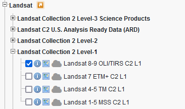
Figure 11.11:
When the results load, you can overlay them on the map by enabling browser overlay to see if your area of interest is covered (figure 11.12). Click Download Options to open the download dialog box.
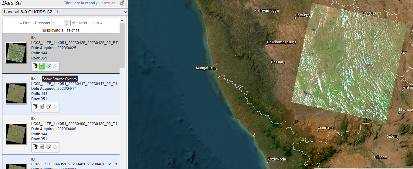
Figure 11.12:
In the Download box, select the files ending in B10 and B11 (11.13) and a file ending in MTL.text and keep them in a folder.

Figure 11.13:
Open QGIS and download the Semi-Automatic Classification Plugin (search for SCP, and it should appear in the plugins manager). This will add a lot of new buttons to your QGIS interface, but what we need can be accessed by going to SCP > Preprocessing > Landsat (11.14).
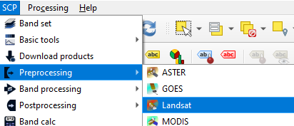
Figure 11.14:
This will bring you to the Landsat preprocessing settings. Figure 11.15 shows you how your settings should look after you have:
- Set the directory containing Landsat bands to the folder where you downloaded and extracted your Landsat images (click on the directory icon beside the input field to navigate it).
- Set the MTL file.
- Checked
Brightness temperature in Celsius. - Checked
Apply DOS1 atmospheric correction.
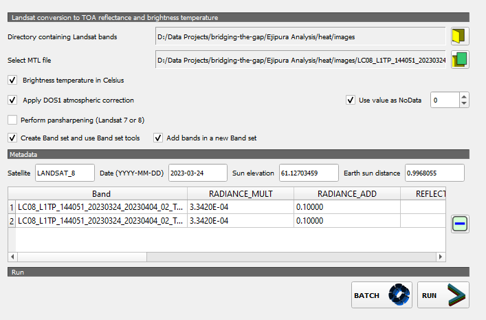
Figure 11.15:
Run the program, and two new layers have been added to your layers panel. We’re interested in the one ending in B10. Notice (11.16) how there’s only one band, and the gradient goes from 35 to 12? That is the temperature in Celsius!
The range is so significant because this one raster file spans around 200 km, and it chooses the minimum and maximum values from that entire area. You must crop this raster to your study site before proceeding further.
I am interested in visualizing heat differences over the Majestic Bus Stand in Bangalore, so I will crop my raster to that extent.
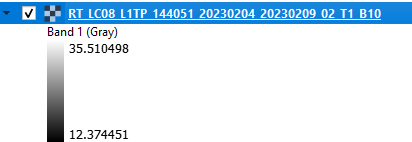
Figure 11.16:
Once cropped, open the Symbology panel and select Singleband pseudocolor, input a nice color ramp that will help you make sense of the values, click Classify and then apply it (figure 11.17).
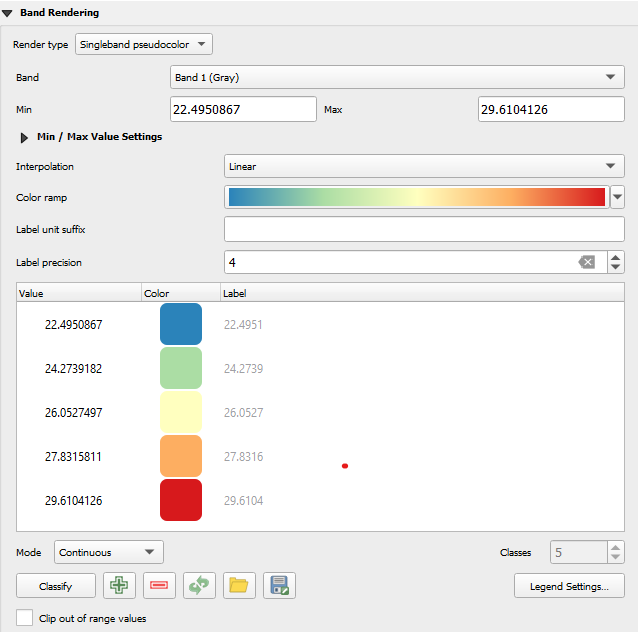
Figure 11.17:
This should color your map with the selected palette. I like to overlay this over the OSM base map to understand where I’m looking.
- Go to
Layer RenderinginSymbologyand make the blend more intoOverlay.Close this dialog box. - In the Browser panel, find
XYZ Tilesand selectOpenStreetMaps. - Place the newly added OSM map under your LST raster.
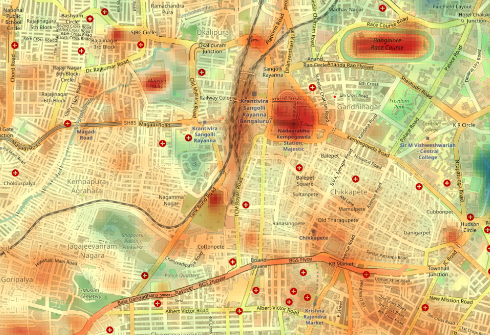
Figure 11.18:
If you’ve ever been to the Majestic Bus Stand, you will know how hot it can get. Due to the concrete built-up area and no trees, this area is far hotter than compared to Freedom Park (figure 11.18). By analyzing temperature data from different city regions, we can identify places where walking might be uncomfortable due to high temperatures. This helps quantify insights that you might get from qualitative interviews and on-ground observations (as described in 14.3).
11.4 Simple flood risk mapping
Flooding can have a significant impact on walkability. Flooded streets and sidewalks can make walking dangerous and uncomfortable, and flooding can also damage infrastructure and amenities essential for pedestrians, such as benches, drinking fountains, and streetlights. It also disproportionately impacts low-income neighbourhoods, which often lack the resources to mitigate flood risk.
We found this to be true in Ejipura, where one of the biggest concerns that residents have is regarding how badly the roads will flood for that particular year’s monsoon.
There are many, many different ways, with equally varying levels of complexity, to map areas prone to the risk of flooding. In the interest of making this work with the most easily accessible data, I present a way to quickly identify low-lying areas through digital elevation models (DEM) in this simple mapping exercise.
We’ll find the DEM data on Sentinel EO Browser. Follow the same steps specified in 11.2.1 to log in, download and locate your area of interest; the only thing that changes is selecting DEM > Copernicus 30. 30 refers to the 30-meter resolution of the DEM (11.19).

Figure 11.19:
I’m downloading it for Ejipura again and cropping it in QGIS to a relevant boundary (which I recommend you do since its easier to see smaller variations for a reduced area). You should now have an image that looks like 11.20.
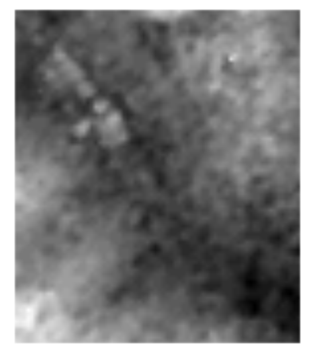
Figure 11.20:
The black pixels represent low-lying areas while the white represents the higher ground, and the gradient between them is everything in between. We need to make this easier to understand so we will draw some contour polygons around them.
Go to Processing Toolbox > Contour Polygons and open the dialog box shown in figure 11.21.
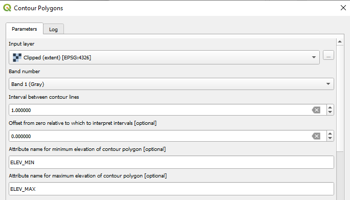
Figure 11.21:
Select the input layer as the clipped raster file and change the Interval between contour lines to how large you want the contour polygons to be. Since this is a small area, I’m entering 1 to have more number polygons (smaller number = denser contours).
When you click run, you should get a new layer with a single colour but lines dividing it into various sections. To make sense of what this means, open Layer Properties > Symbology and set it to Graduated. For the value, select ELEV_MAX (or ELEV_MIN, since the DEM is a single band file, both correspond to the same value). Change the colour ramp to something nice as well (figure 11.22).
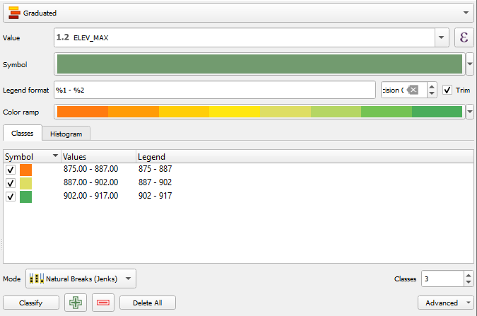
Figure 11.22:
Two other settings control how your contours will be classified and coloured:
- The
Mode(in fig. 11.22, it is set toNatural Breaks). Natural breaks mode looks for natural groupings or “breaks” in the data based on the distribution of the values. It tries to create classes that have the largest differences between them, based on where the data naturally cluster. You can try other modes as well. - The number of
Classes(set to3in 11.22). I have chosen a small number here because I want only three colours on my map, making it easier to distinguish areas.
Apply your changes!
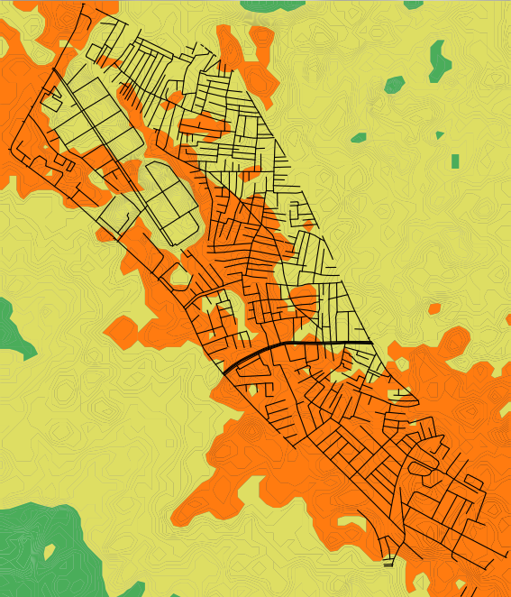
Figure 11.23:
Figure 11.23 shows the resulting map with an overlay of the roads in Ejipura, just to add some context about what we are looking at. The orange areas are low-lying and hence more susceptible to flooding in case of an extreme weather event.
To use this in the context of your audit, consider checking whether the footpaths, roads or drainage in this area will still facilitate walking if they were waterlogged. You can even try searching for incidents of such flooding in the areas that become highlighted.
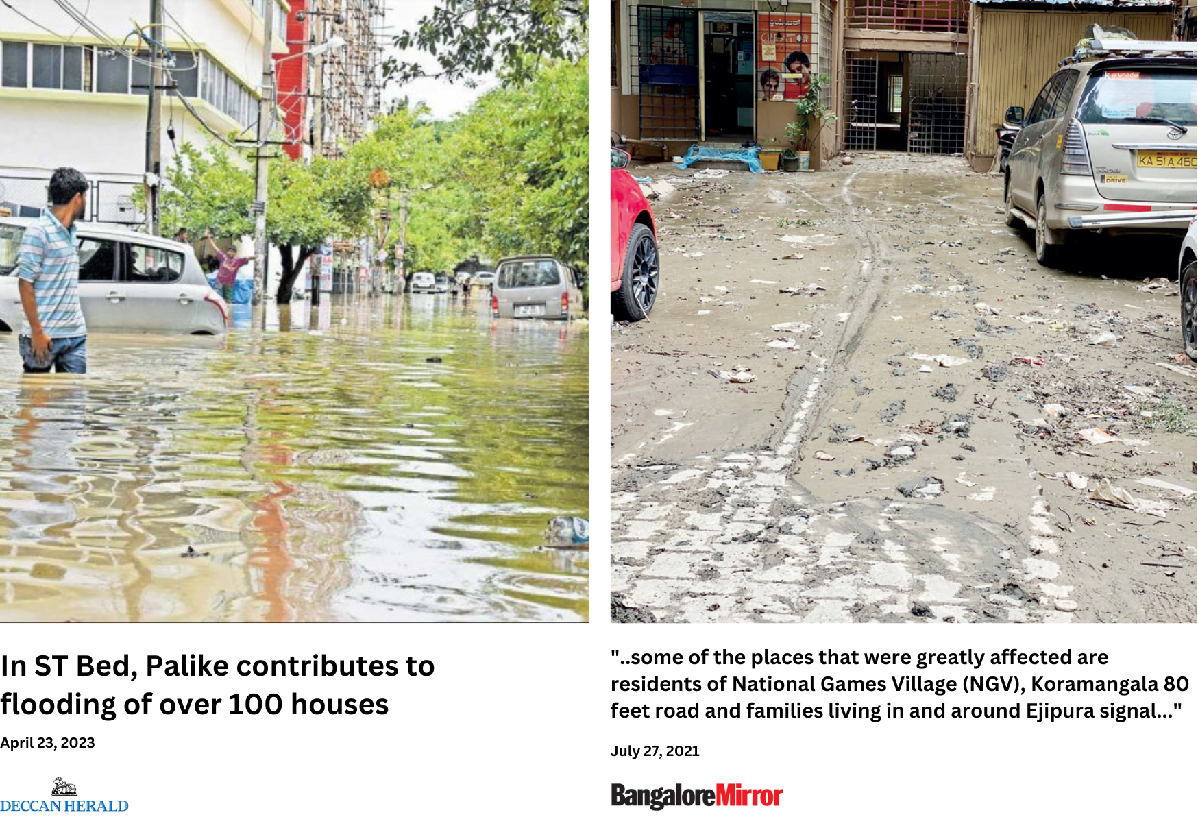
Figure 11.24:
A cursory search for the highlighted area in figure 11.23 in local news outlets shows how common flooding is in this part of Ejipura (Reddy, 2021, and Ist n.d.; Kulkarni 2017), with one even highlighting how the roads become unusable when such incidents do happen.
While simplistic, it should give you enough for further research and assessment.